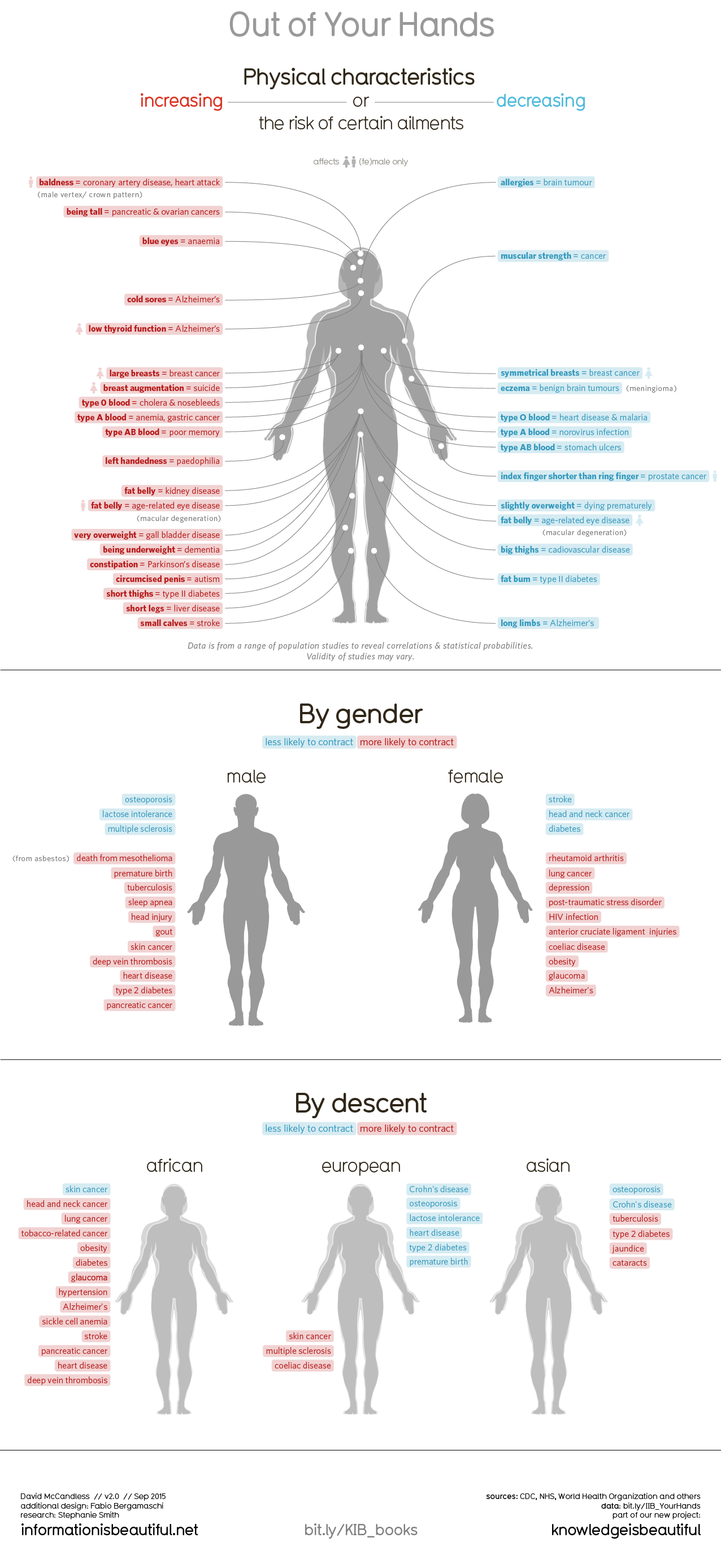
Information Is Beautiful‘s website has an elegant infographic with human bodies all over it.
But they’re not just tastelessly flung about in suggestive positions, the bodies. No, these are clinical illustrations of the human form, the featureless outlines of bodies, their pigment in the grayscale.
The body outlines are meant to pose as labeling dummies for the infographic’s true intent: explaining how the physical characteristics people genetically have or actively cultivate over time can determine an increase or decrease in the risk of certain ailments.
The infographic’s titled, Out of Your Hands, suggesting that certain elements of our health condition is out of our control; we are, in a sense, going to have to cope with the biological hand we’ve been dealt.
Which isn’t so surprising, but these graphics take the notion in an interesting direction.
Though the data is based “on a range of population studies to reveal correlations and statistical probability”, it is presented in an easily digestible format that sends home its message in a clear, neatly-packaged design.
The overall visual scheme is pretty basic. In the first graphic, split right through the center, splitting our dummies, is the measurement differential. Left side lists the increase in ailments, or physical characteristics correlated to a greater likelihood of incurring some health liability; the right shows the opposite, listing the physical characteristics more likely to reduce the risk of that liability. Color coding has the increased risk in red and the decreased risk in blue.
Lines fan and curl out from different spots on the body to their appropriate label. One white dot, for example, at the bodies’ left thigh starts a line going left to the red label, “Short Thigh = Type II diabetes“, meaning that possessing that characteristic could increase the risk of becoming diabetic. A dot on the right hand has a line moving right, toward “Index finger shorter than ring finger = prostate cancer” in blue. That means if your ring finger’s better endowed, so to speak, than your pointer, you’re less likely to get that disease.
There are 15 other ailments listed on the left, 12 on the right.
Simple. But effective. With a touch of anxiety, I was double-checking fingers on both hands after viewing, and exhaling a sigh of relief that my fingers were all aligned to provide maximum health benefits.
Scrolling down the page, the next infographic shares the same theme as the first, but the overlapping male/female body divides in two, male to the left, female right, and the health risks and benefits based on gender get listed on the outer-sides. It was no shock to see males had a larger number of included health risks, but I was surprised to find that men were less likely to acquire M.S. whereas females had a reduced risk of diabetes.
In the next graphic, the body outlines categorize into three primary branches of ethnic descent: African, European and Asian. This visualization features the health risks and benefits based on race. Peoples of African descent, so tells the viz, are less likely to get skin cancer, but more likely to be anemic. European races find that they are more likely to suffer skin cancer, but less likely to be lactose intolerant.
One helpful addition to the infographic, where the data’s available, could be the inclusion of percentages to indicate the degree to which a certain health risk/benefit might occur. For example, does having a longer index finger give me a 13% greater chance that I might get cancer? Or maybe a range, say, 10-20%?
Another keen improvement would be to offer a more interactive experience than a jpeg file, with roll-over pop-ups that show more detail about a given ailment, and maybe some info why these physical anatomical factors cause certain ailments.
The data is cited and full credits are displayed near the bottom of the page.
